An Exciting Refresh For Engage
We are happy to announce a brand refresh and a new website for Engage.
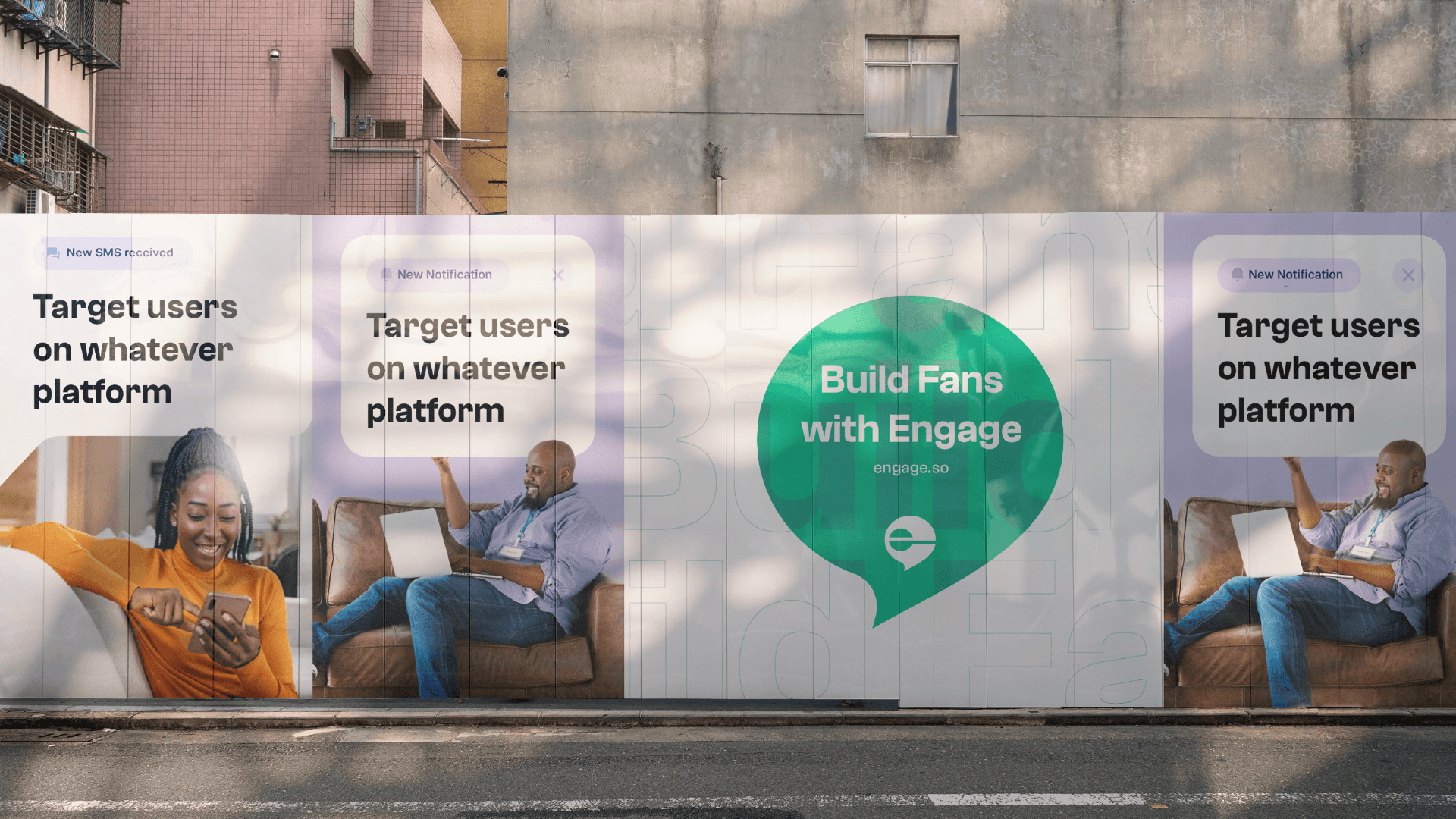
Our drive to create a seamless customer messaging experience for every business puts us in a position of constantly being clear and unique. For us, it is about the impact and not titles or roles. How do we create a great experience for that solo founder managing signups for their waitlist, and also that bigger company trying to build better customer retention through messaging?
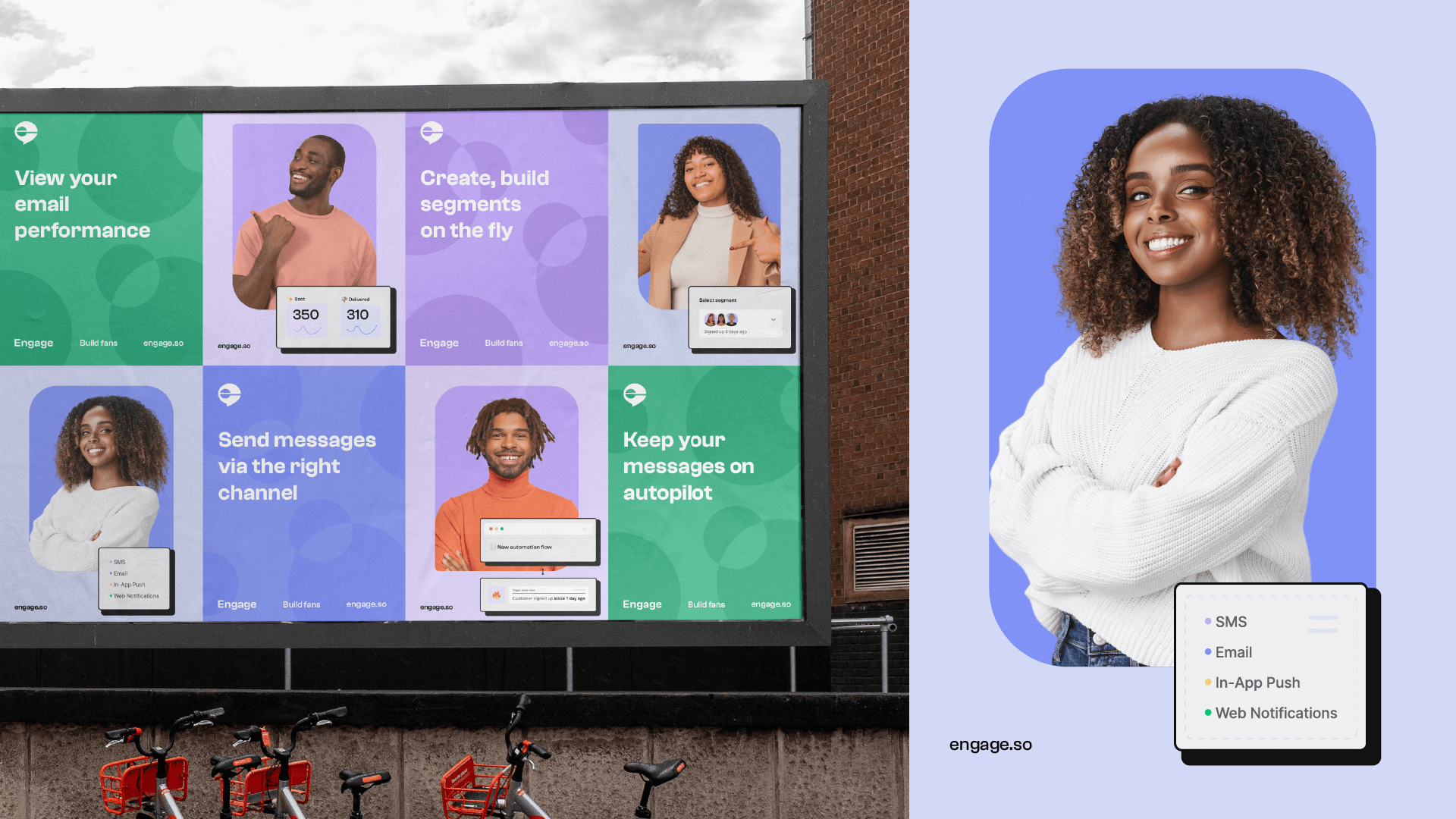
Following this drive led the in-house design team to birth a new refreshing identity.
Our new identity ✨
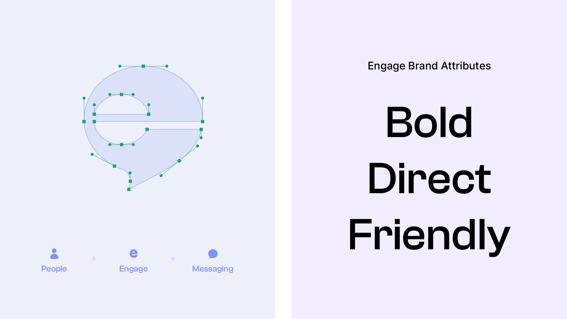
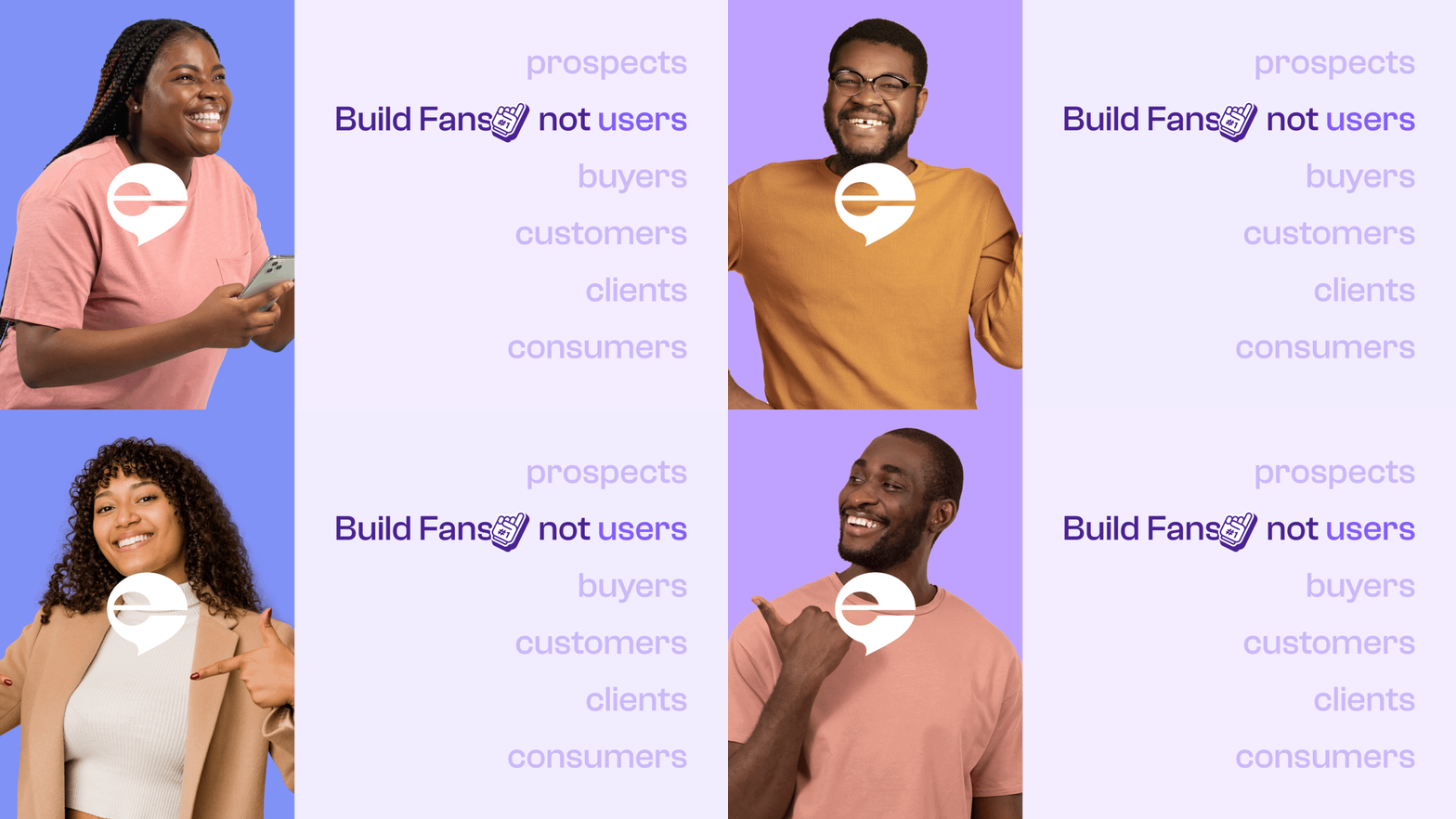
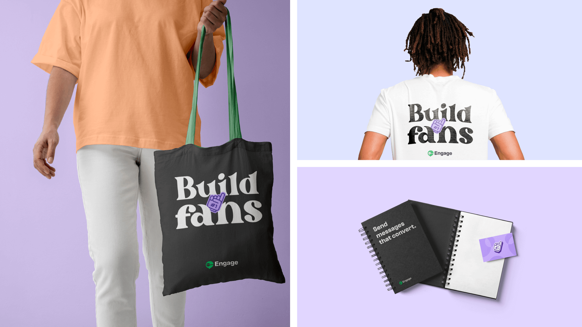
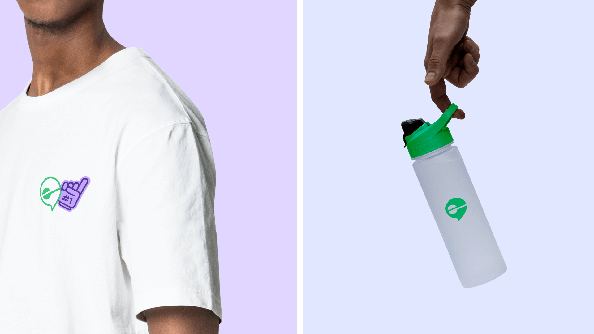
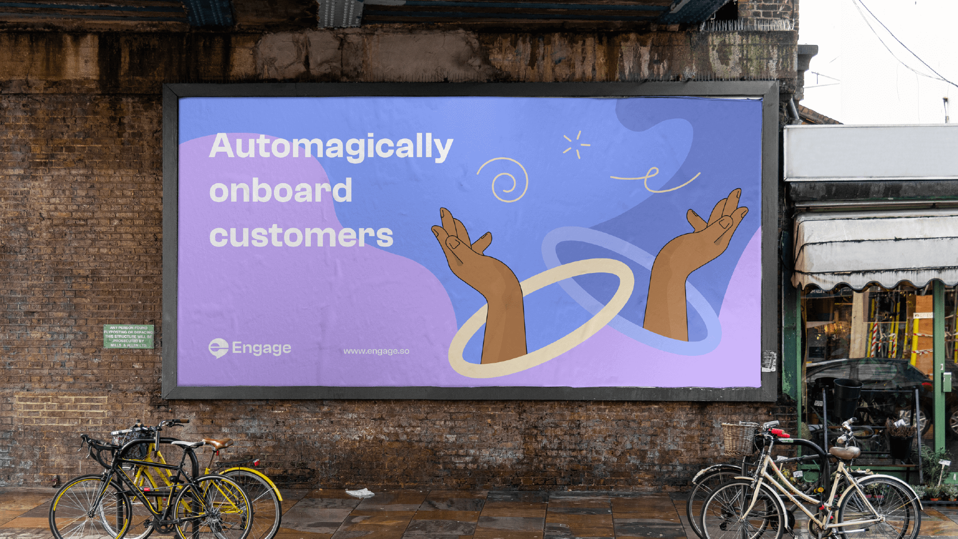
When businesses engage *pun intended* with their customers, messaging matters. With this in mind, we ensured our mark clearly showed this effortlessly. The mark is a combination of the message icon and the letter E. A “retro meets modern” theme is applied to the logo and the entire identity, giving our brand a rather distinct feel.
Colour scheme, typography, and expressions
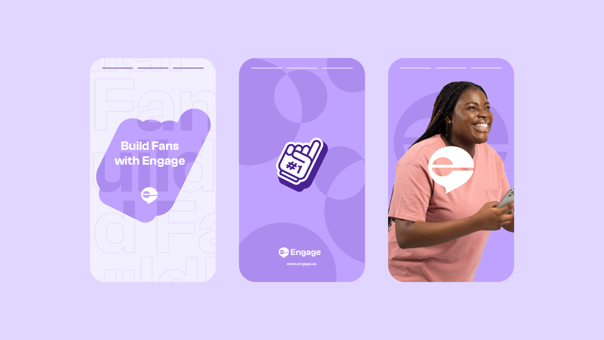
Our previous color scheme largely contained green. While it symbolizes growth, we included a tint of purple and blue. When viewed collectively, these colors provide a vibrant and delightful feel, which is the experience we want customers to feel while using Engage.
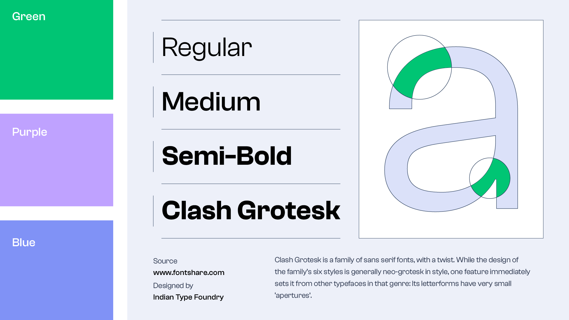
The new primary typeface is “Clash Grotesk”, a Grotesk typeface suitable for large/display texts that blend well with the identity. This further evokes a sense of being bold (as we have realized there are great benefits to using our product).
Our new website 💫
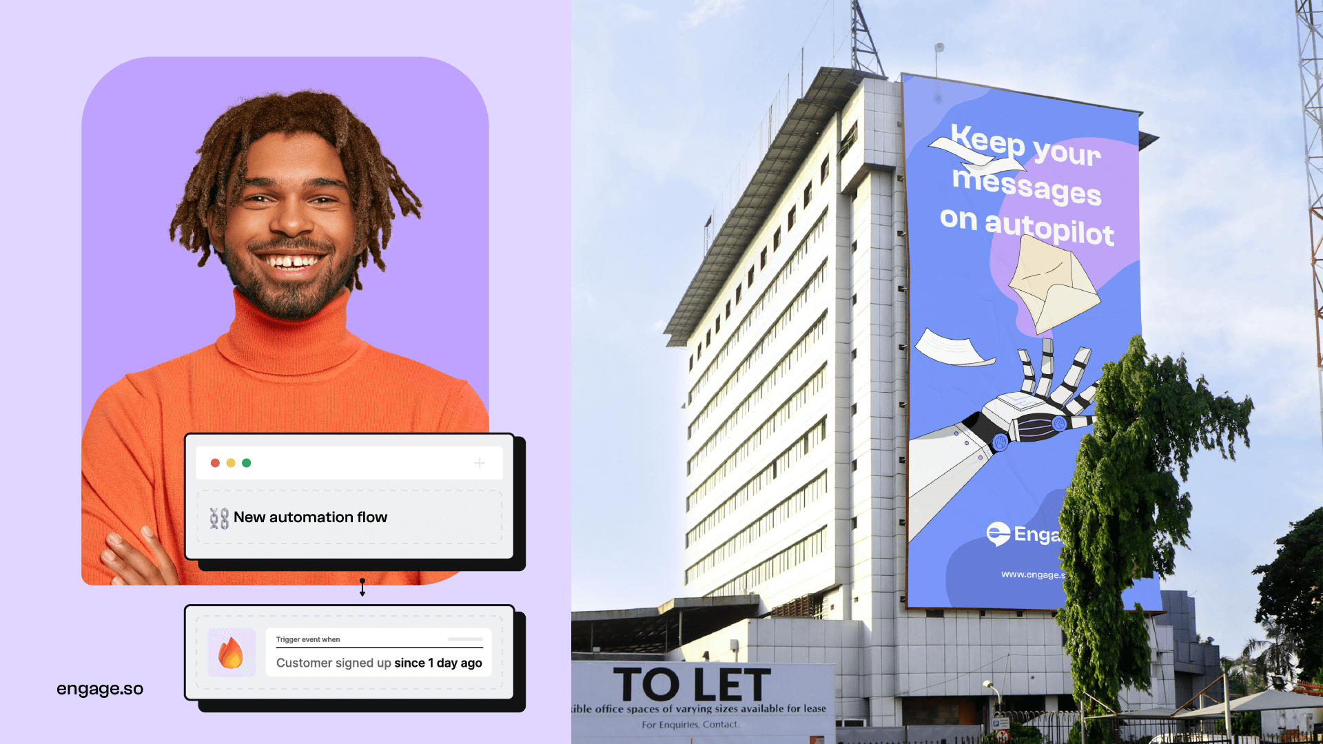
A website is a key touchpoint and usually a customer’s first experience with the brand. We ensured the brand’s messaging and theme across the identity were consistent with the website.
We doubled down on simplicity while providing customers with a delightful experience. Check out our new website.
Towards the future
For us, causing great impact and consistent value will always be important. We aren’t so focused on fancy merch or a shiny website, but rather a rededication of our commitment to helping businesses build fans.
